Branding • Web Design
Hellfire
Date
2023 - 2024
My role
Visul Design, Web Design, Brand Development, Wireframing, Prototyping, UI Design, Mentoring, Developer Collaboration
In collaboration with South Dublin County Council and Coillte we designed a brand identity, and website to launch the new Hellfire Dublin Mountains Visitor Centre.
Designed by Hanah Vickers and the team at Teneo Studio in Dublin.
The Goal
The gateway to heritage
Hellfire is a project initiated by South Dublin County Council, with support from Coillte, to establish a new gateway to the Dublin Mountains. This initiative aims to welcome more visitors and enhance the experience for both South Dublin residents and tourists from across Ireland and beyond.
The Foundation
User Research
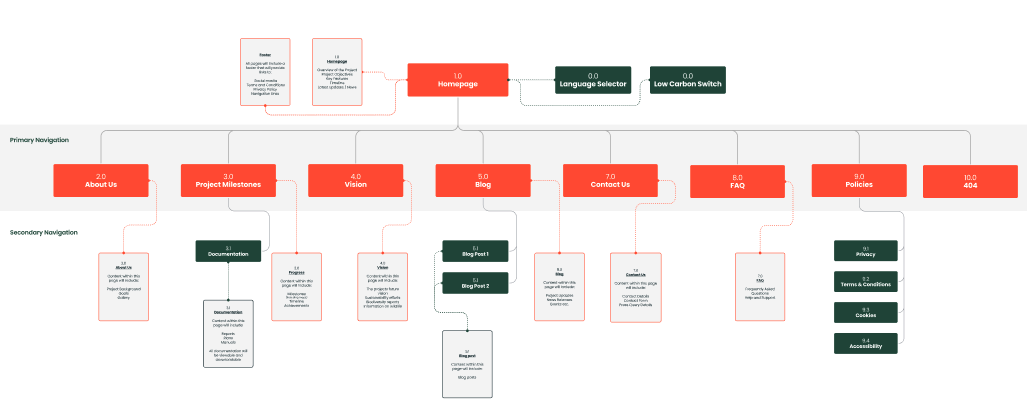
This project involved a wide range of stakeholders, including government bodies, business representatives, and local action groups. The team at Teneo conducted thorough user research, crafted the brand narrative, and devised the communication strategy. We organised stakeholder workshops, surveys, developed detailed user personas, and performed competitor analysis to deeply understand the needs, wants, and goals of each user group. All of this informed the design of the visual identity, sitemap and ultimately the website.
The Visual Identity
Crafting a Brand
Building on the team's naming and brand positioning research, a new logo and tagline were created to capture the essence and character of the new development.
Hellfire’s visual identity shapes the audience’s first impression of the brand. As a family-friendly amenity it’s a destination that feels like stepping out of this world and into the woods. As such, the brand identity needed to balance professionalism with approachability, providing credibility while remaining flexible and adaptable to accommodate future growth and expansion.
The Visual Identity
Evolving for Digital
The visual identity went through further development to adapt it for web. We expanded the colour palette, tested it for accessibility against WCAG 2.2, developed a typographic hierarchy, defined grid layouts and built components based on atomic design principles.
The Building Blocks
Wireframing and Design
We developed a grid system to ensure consistency across layouts, crafted detailed wireframes to map out the website’s structure and user flow, and developed and refined designs that align with the brand’s visual identity to ensure that every element was beautiful and functional.
The Bigger Picture
Sustainable Design
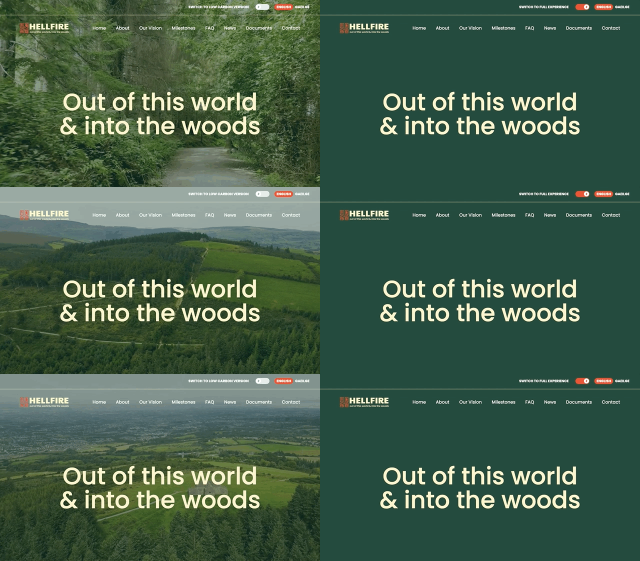
We integrated a number of features within the web design that focused on sustainability the most obvious being the inclusion of a low carbon switch on the website. Following research showing drone footage is one of the heaviest types of content to load on a website, making it less sustainable compared to other media types the low carbon switch turns this and all other images to solid green.
The Result


